East Toronto Health Partners (ETHP), the Ontario Health Team (OHT) serving East Toronto, unveiled its new logo and brand today, further strengthening the partnership between its 50-plus members and their collective work in creating an integrated system of care across their communities.
The logo’s imagery features three figures whose arms are outreached and wrapped around one another. The dynamic, free-flowing lines illustrate the collaboration, trust and connectedness across ETHP in a harmonious way and are based upon the waterways that border and run through East Toronto, including the Don River, Taylor Massey Creek and West Highland Creek.
It was designed by Randal Boutilier, principal and creative director at 12thirteen Design, which is based in East Toronto, following a collaborative community engagement process that involved branding focus groups, online surveys and a virtual branding forum. During these sessions, feedback was gathered from more than 120 ETHP members, including patients, caregivers, health care and social services organizations, and family physicians on behalf of the East Toronto Family Practice Network (EasT-FPN).
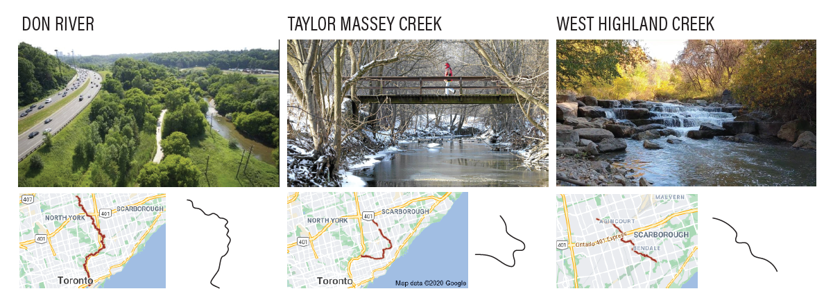
ETHP’s new logo is based on the waterways that border and flow through East Toronto.
“For the imagery, we wanted to find a detail that was unique to East Toronto and set the area apart from the rest of the city,” Randal said. “Many [ETHP members] commented on the natural settings that are interspersed through many neighbourhoods, and in looking at a map of the area we noticed that there are significant waterways that run through much of it.”
The logo’s core colours — vibrant shades of blue, green and orange — are common to many of those found in the branding of ETHP’s partner organizations, offering a sense of visual harmony when they are displayed together. The font, Montserrat, was selected because it is clean and easy to read in a range of sizes both on-screen and in print.
This visual identity proved the most popular among ETHP members when it was presented as one of three finalists in an online poll. These finalists were narrowed down from an initial list of nine options.

The evolution of ETHP’s new logo based on feedback from ETHP members during the branding engagement process.
“I like the fact that it allows for the concept of ease of communication between the folks concerned with the development of a care plan,” said Mussarat Ejaz, community health worker at Flemingdon Health Centre (FHC) and a member of ETHP. “[It looks as though they are] sitting and discussing together.”
The logo “visually depicts ‘patient-centric’ care,” added Martin, a family caregiver in East Toronto who is also a member of ETHP. Martin saw the “orange ‘bobble head’ as a patient in the middle flanked by blue and green members of patient’s care team. The heads of the two ‘care-providing bobble heads’ are turned and focused on the patient.”
“The symmetry gives a sense of balance and solid foundation, whereas the wavy lines and circles give a sense of unity, flexibility, creativity and flow,” said Dr. Michael Chu, a family physician in East Toronto and a member of ETHP on behalf of EasT-FPN.
ETHP’s new logo and branding will be used in corporate materials and on the ETHP website, community newsletters and ETHP’s recently launched Twitter to promote the partnership’s collaborative programs, services and people.
It will help unify the OHT’s members, which includes community, primary care, home care, hospital and social services organizations in East Toronto, and exemplifies the partnership’s commitment to working with patients, families and local residents as One East Toronto to co-design a healthcare system that works better for everyone.
“The broad engagement in this branding process was as important as the finished product. It has been a wonderful collaborative effort and an expression of the passion and commitment that is at the heart of ETHP,” said Carol Annett, CEO of VHA Home HealthCare (VHA) and a member of ETHP. “It has ensured our new visual identity is truly representative of our partnership and the work we are doing together to make care better for the people of East Toronto.”
“My hope is that this visual identity resonates with those in the community,” added Randal. “I feel that the collaborative approach we took speaks to the way ETHP is working with its partners and populations, and we treasure this experience. I hope that this work reflects the many people putting energy and effort into the creation of caring connections for all who live within our one East Toronto.”